


In a world saturated with overstimulation—bold neon signage, algorithm-fed advertisements, and trending aesthetics that shift weekly—there is a quiet rebellion happening in the realm of color. Minimalist color palettes, long associated with modernism, Scandinavian interiors, and capsule wardrobes, are enjoying a powerful resurgence. But this trend is more than a fleeting fashion statement. It speaks to a deeper human desire for clarity, restraint, and emotional balance in visual environments.
Minimalist color palettes are not merely the absence of color. Rather, they are a deliberate, curated expression of tone, temperature, and mood. Whether you find peace in soft monochromes, bold statements in two-color contrasts, or storytelling in muted earth tones, the power of a minimalist color palette lies in its ability to communicate without chaos. This essay dives into the anatomy, psychology, and contemporary use of minimalist color palettes across art, fashion, and design—showing how, paradoxically, less can often say so much more.
The Philosophy Behind Minimalist Color
Minimalism is often misunderstood as synonymous with sterility or blandness. In fact, the minimalist movement originated as a counterpoint to the chaos and emotionalism of earlier art and design movements. Artists like Donald Judd and Agnes Martin were interested in purity of form and intentional use of space—and color was integral to their compositions. The principle was not about removing everything but about reducing to the essential.
In color theory, minimalism challenges the belief that vibrancy equals visual interest. A minimalist palette relies on harmony, balance, and subtle contrast. A composition of greyscale tones or soft beige gradients can evoke serenity, while stark duotones like black and white create powerful juxtapositions. These palettes encourage the viewer or user to slow down and look closer, paying attention to detail, form, and texture.
Why Minimalist Colors Resonate Today
Our current era is marked by sensory overload. The average person scrolls through thousands of images a day, often without absorbing a single one. In this context, minimalist color palettes offer a form of visual mindfulness. They serve as a buffer from noise, a curated oasis in an overwhelming landscape.
There’s also a cultural shift toward intentionality—seen in slow fashion, eco-conscious consumerism, and digital decluttering. Minimalist palettes reflect these values by stripping design down to what’s necessary and meaningful. It’s no coincidence that brands like Muji and Everlane, which emphasize simplicity and ethical production, use minimalist color schemes—soft greys, clean whites, subdued navy—across packaging, websites, and products.
Palette One: Soft Monochrome
One of the most calming and visually coherent minimalist palettes is the soft monochrome. This involves using variations of a single hue—different saturations and brightness levels—to create depth and unity. Think of a pale dusty rose applied across fashion, interiors, and digital interfaces: blush walls, pink-beige linen, a soft terracotta ceramic mug. The repetition of color in varying degrees invites cohesion and warmth.
In fashion, this palette translates beautifully in layered looks. A cashmere cream coat over an ivory turtleneck paired with bone-toned trousers feels deliberate yet understated. It doesn’t shout for attention, but it leaves a lasting impression. In digital design, soft monochromes are ideal for background interfaces and wellness apps—they feel nurturing, spacious, and calm.
Palette Two: Greyscale with a Hint
Greyscale is the quintessential minimalist palette—evocative of ink drawings, photographic negatives, and architectural renderings. However, what modern designers are doing is adding a subtle accent hue to disrupt the grayscale rhythm: a soft yellow cushion on a charcoal couch, a forest green button in a monochrome app interface, or a rust-toned handbag with a grey tailored outfit.
This “greyscale with a hint” approach honors the minimalist ethos while allowing room for personality and mood. The pop of color doesn’t scream—it whispers. And that whisper often has more emotional impact than an explosion of saturation.
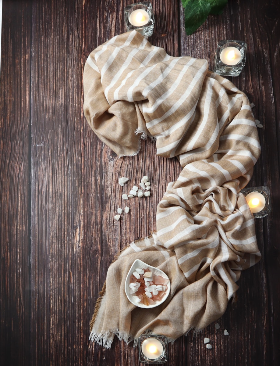
Palette Three: Natural Neutrals
Inspired by the landscape, natural neutrals include sand, clay, stone, and oat tones. These colors are closely associated with the organic modern design trend, which merges minimalism with natural textures and forms. The appeal lies in how grounding and sensory these colors are—they evoke earth, warmth, and familiarity.
A minimalist neutral palette used in interiors often combines tactile materials: an off-white boucle sofa, a jute rug, and unvarnished wood. In fashion, natural neutrals dominate capsule wardrobes for their versatility and longevity. These are clothes that transcend seasons and trends, pieces that feel rooted in time rather than hurried by it.
The neutrality of these palettes does not equate to emotional emptiness. On the contrary, they can be rich with feeling—nostalgia, serenity, rootedness—precisely because they mirror the natural world we instinctively trust.
Palette Four: Bold Two-Color Contrast
Minimalism isn’t always about softness. A stark two-color contrast can be just as minimalist if handled with restraint. Black and white is the most classic pairing—used everywhere from corporate logos to contemporary photography. But other bold duos like navy and cream, forest green and alabaster, or burnt sienna and beige also create compelling visual identities.
This palette is especially effective in branding, architecture, and fashion editorials. It allows for high impact with low visual clutter. For instance, a black blazer with white piping, or a white gallery wall with one singular navy painting, draws the eye in a focused, intentional way. This use of contrast can create hierarchy, direct attention, and underscore sophistication.
Emotional Impact: Color as Language
Colors carry psychological weight, and minimalist palettes make the most of this by carefully choosing each hue for emotional effect. Cool tones (blues, greys, muted greens) are often used to calm or clarify. Warm tones (nudes, browns, soft terracottas) provide comfort and stability. High-contrast palettes (black-white, navy-cream) can evoke sharpness, decisiveness, and clarity of purpose.
When colors are used sparingly, their power intensifies. A minimalist palette forces you to consider color not as background noise but as a voice. And like any good orator, the more deliberate their words, the more profound the impact.
Minimalist Color in a Maximalist World
Some critics argue that minimalist palettes can be elitist or trend-driven. Certainly, when minimalism becomes a competition over who has the most monochrome home or Instagram feed, its deeper purpose gets lost. But true minimalist color isn’t about perfection or aesthetics alone—it’s about intention.
Minimalist color design, when done well, transcends taste. It becomes a way of thinking—considering what is essential, what adds harmony, and what invites calm. It’s not about erasing creativity but refining it, distilling it to its most potent form.
In a world that moves fast and sells chaos as normal, choosing simplicity is an act of resistance. Whether you’re painting a room, dressing for the day, or building a brand, the colors you choose say something. Let them say something worth hearing.


Discussion about this post